Zeena
In collaboration with brandbuch
Design ········· Josh Nathanson
Client ········· Zeena
Photography ···· Marta Castillo Sampedro
Animation ······ Eva Sánchez Clemente
Location ······· Catalunya, ES
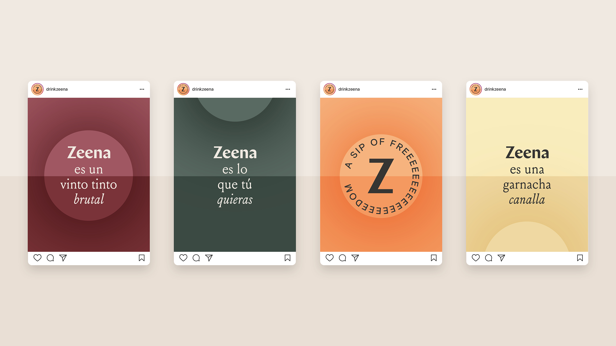
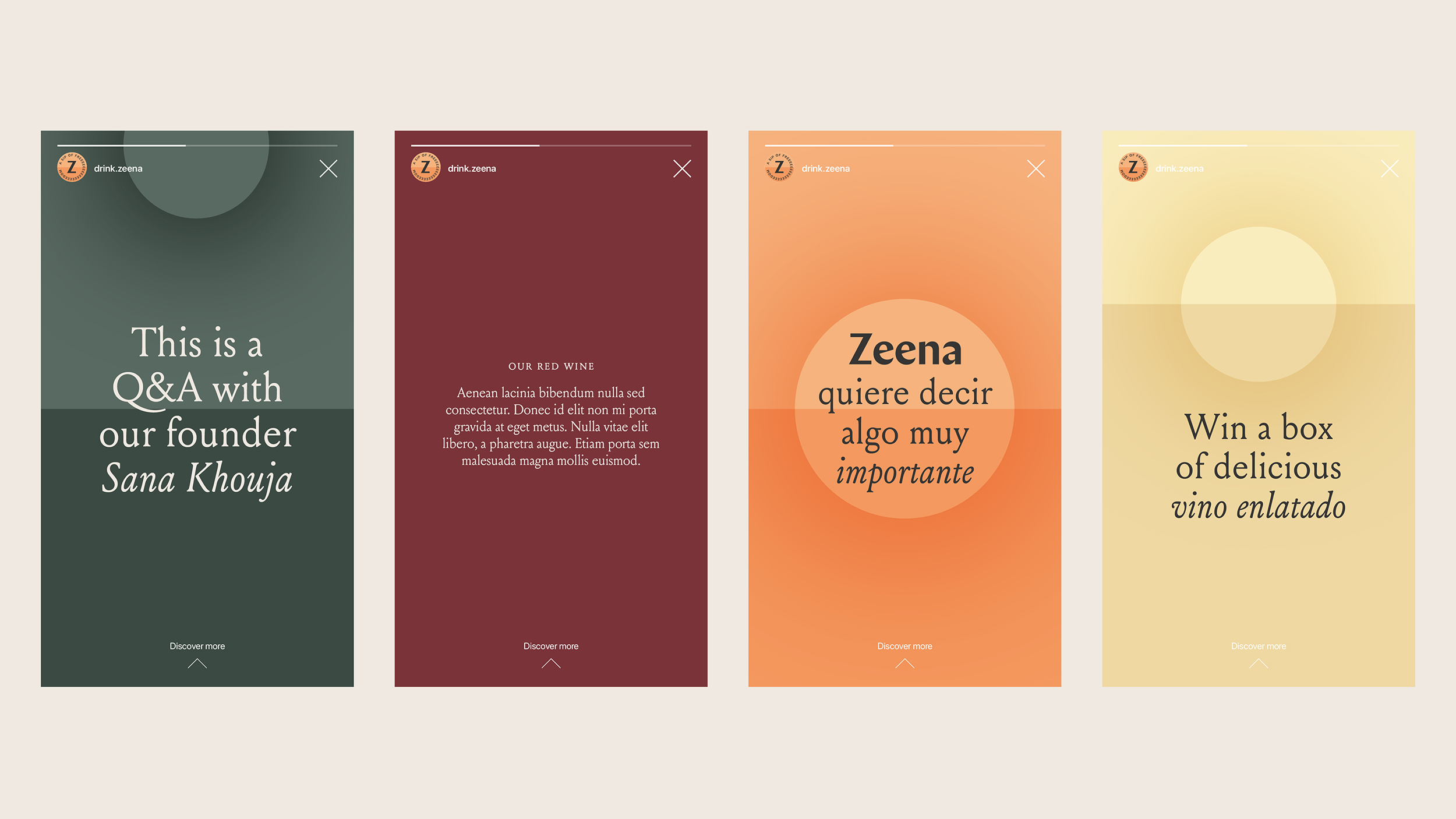
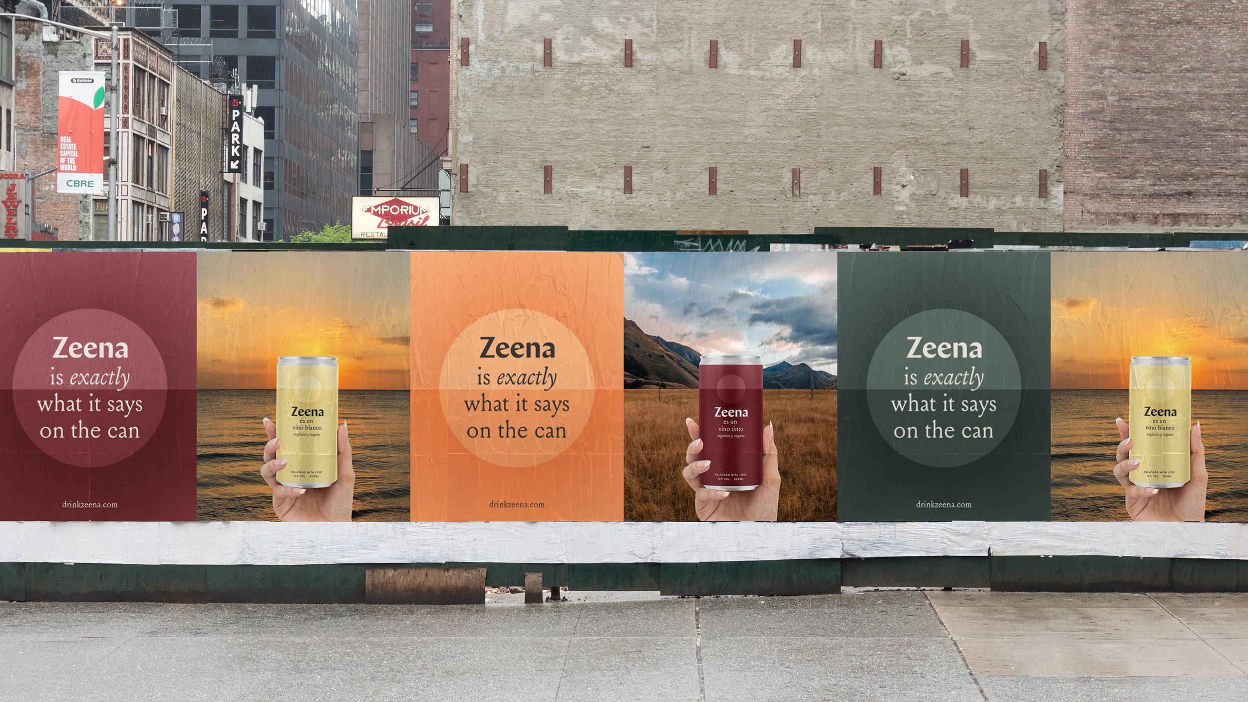
Zeena was created by Sana Khouja with a desire to disrupt the wine industry. By packaging wine in a can, it opens possibilities to reach new audiences who can enjoy it freely & on-the-go.
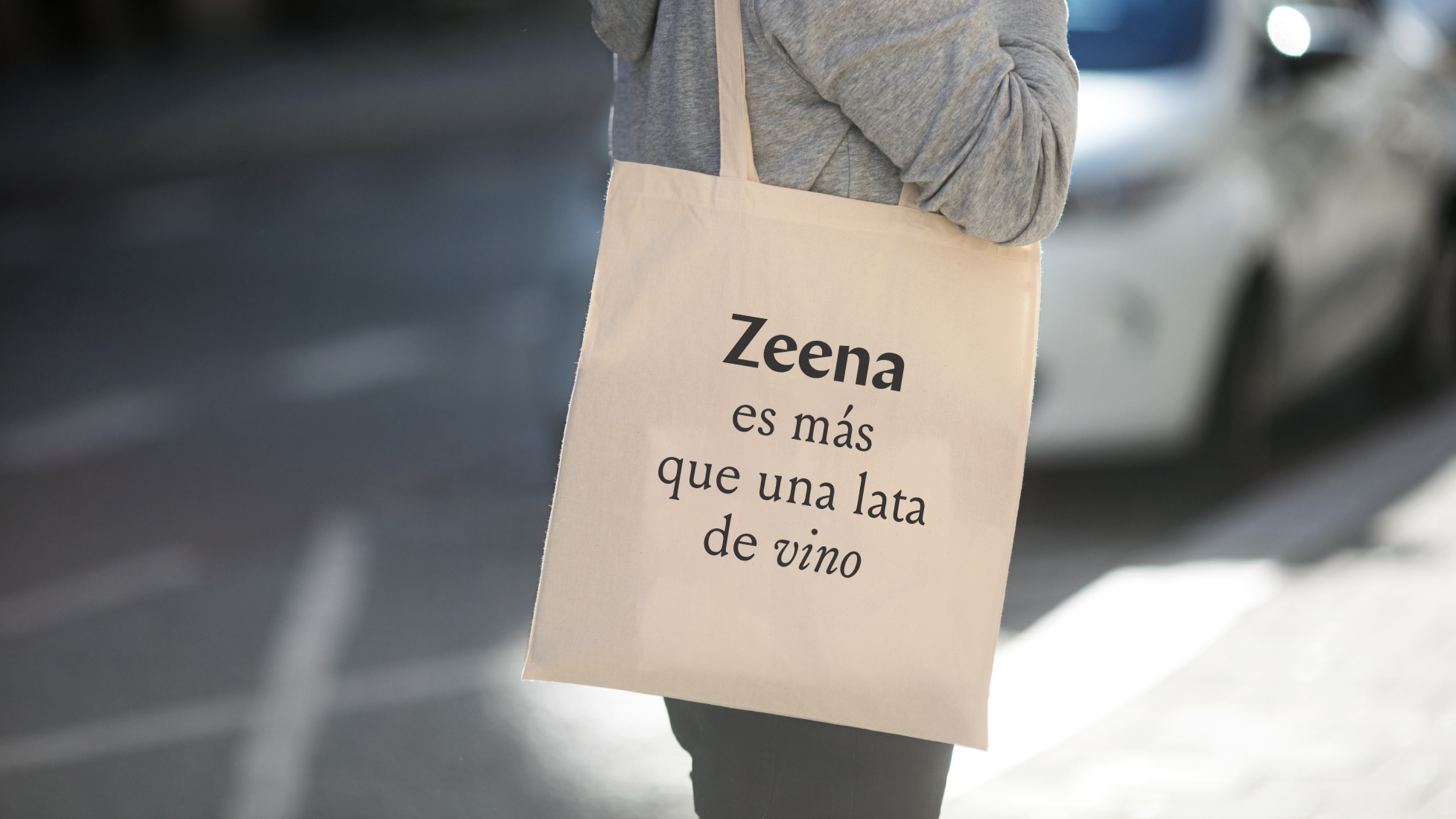
With that sentiment in mind, helping people to choose freely is the purpose that, together with brandbuch, we put at the heart of the visual identity. In order to choose freely, you need to understand easily. For this reason we created Zeena with a self-explanatory, matter-of-fact tone and a minimalist look & feel.
With that sentiment in mind, helping people to choose freely is the purpose that, together with brandbuch, we put at the heart of the visual identity. In order to choose freely, you need to understand easily. For this reason we created Zeena with a self-explanatory, matter-of-fact tone and a minimalist look & feel.

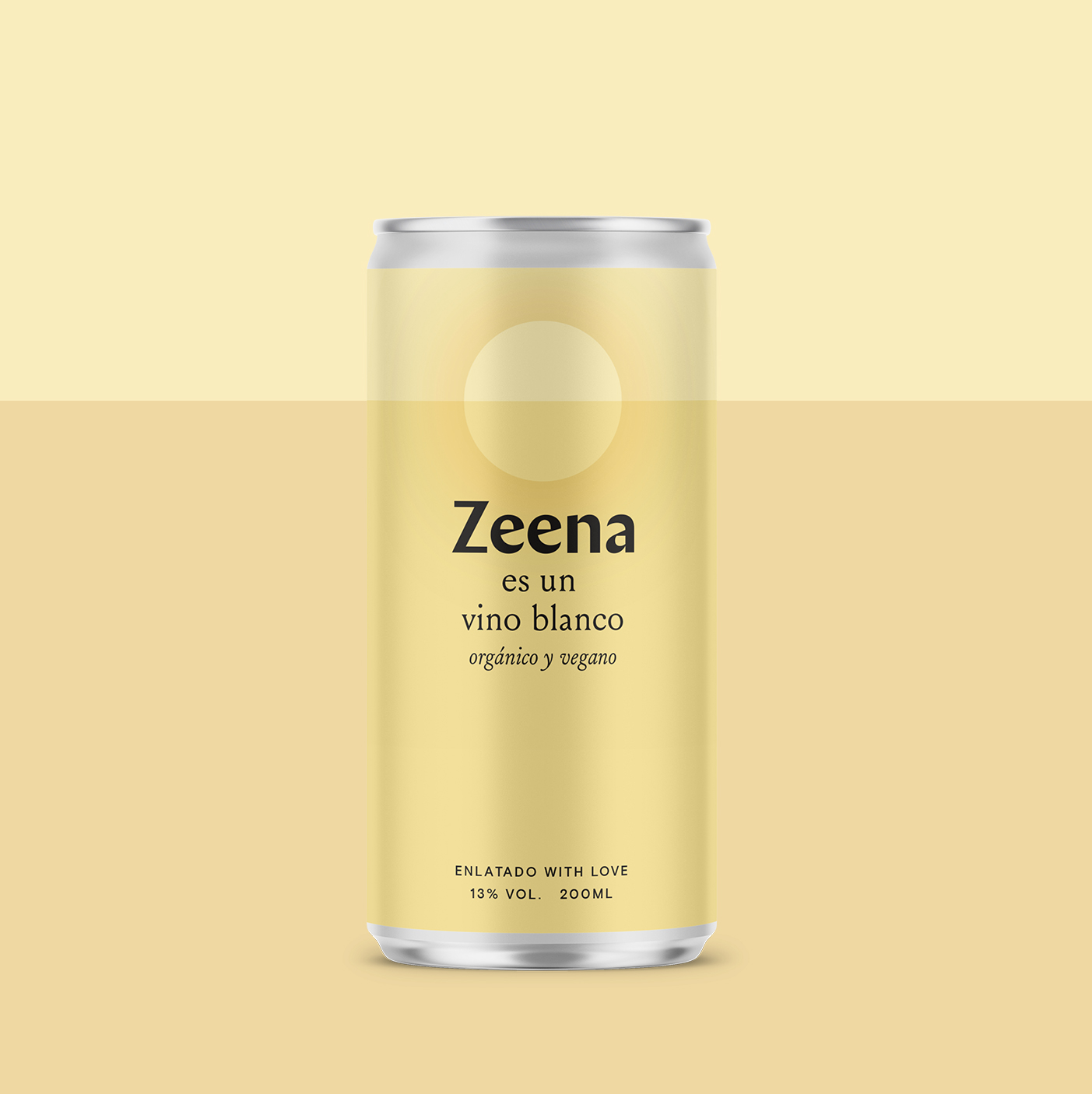
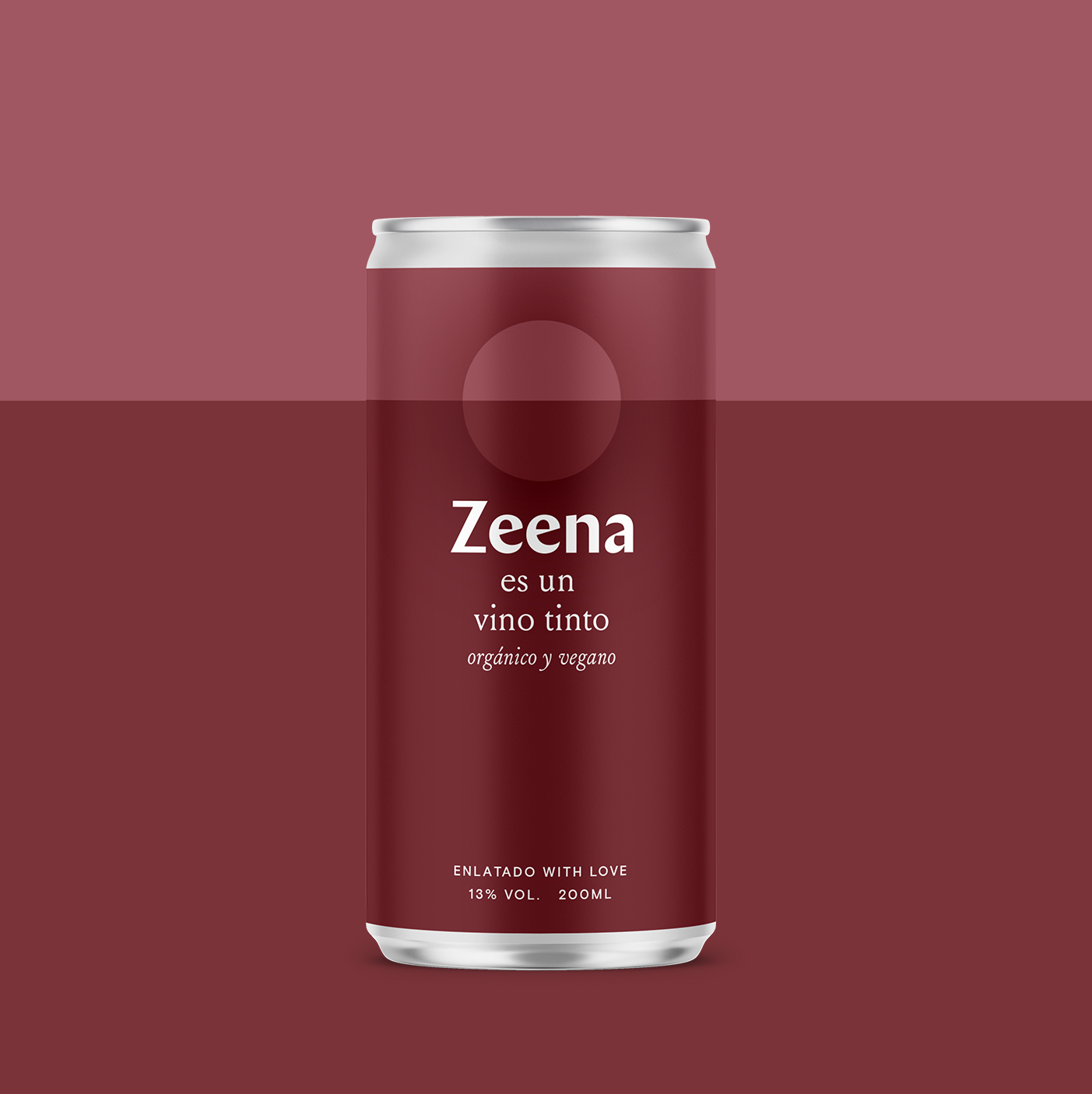
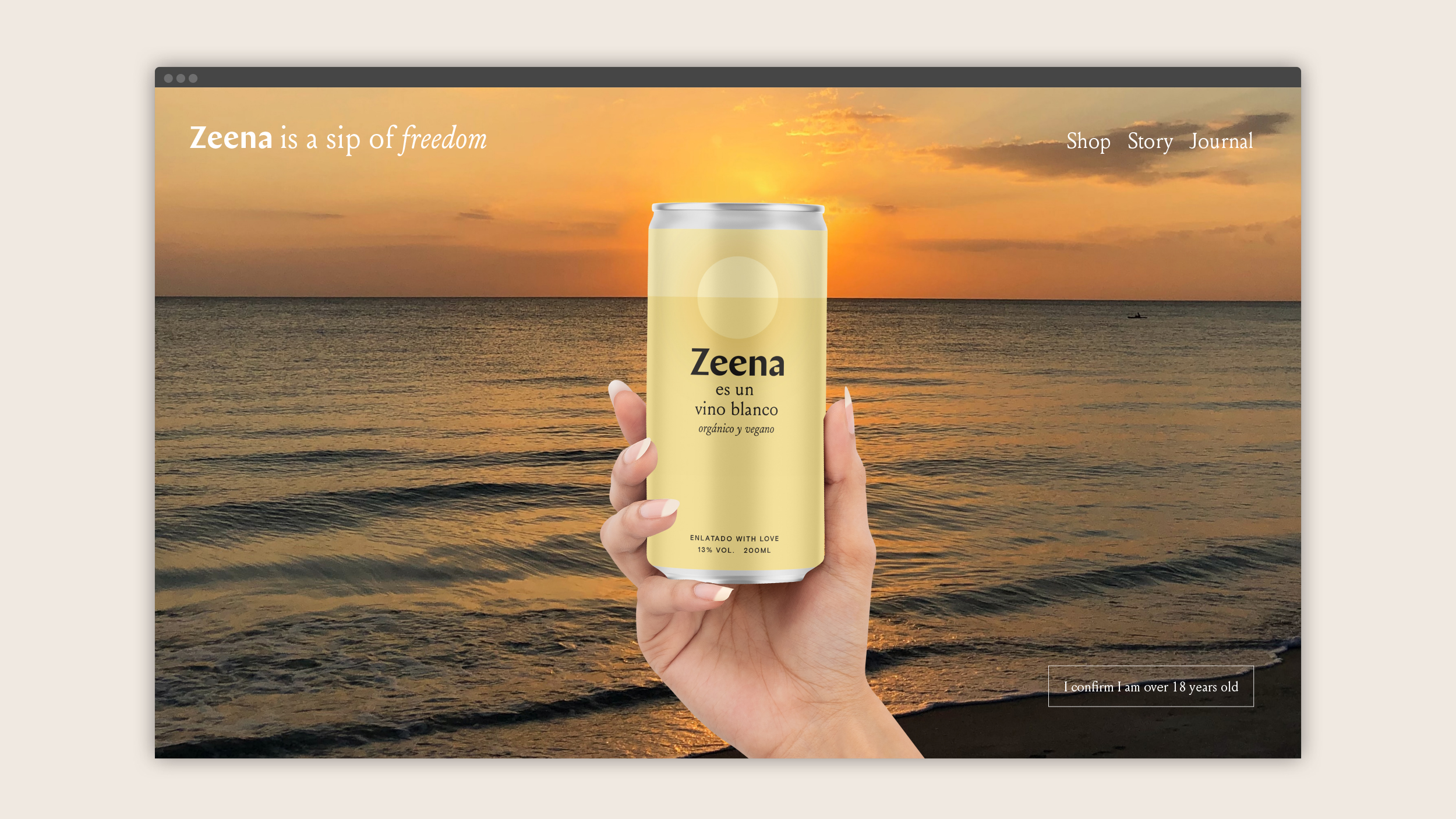
The packaging translates as “Zeena is an organic and vegan white wine” (and red wine).


The sun background represents freedom, following a dream and being natural. The horizon line acts as an important connecting element throughout the identity.
Homethings
Design ········· Josh Nathanson
Client ········· Homethings
Website ········ Glass
Location ······· London, UK
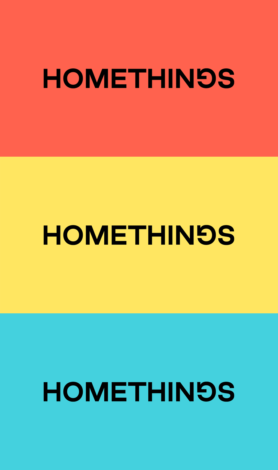
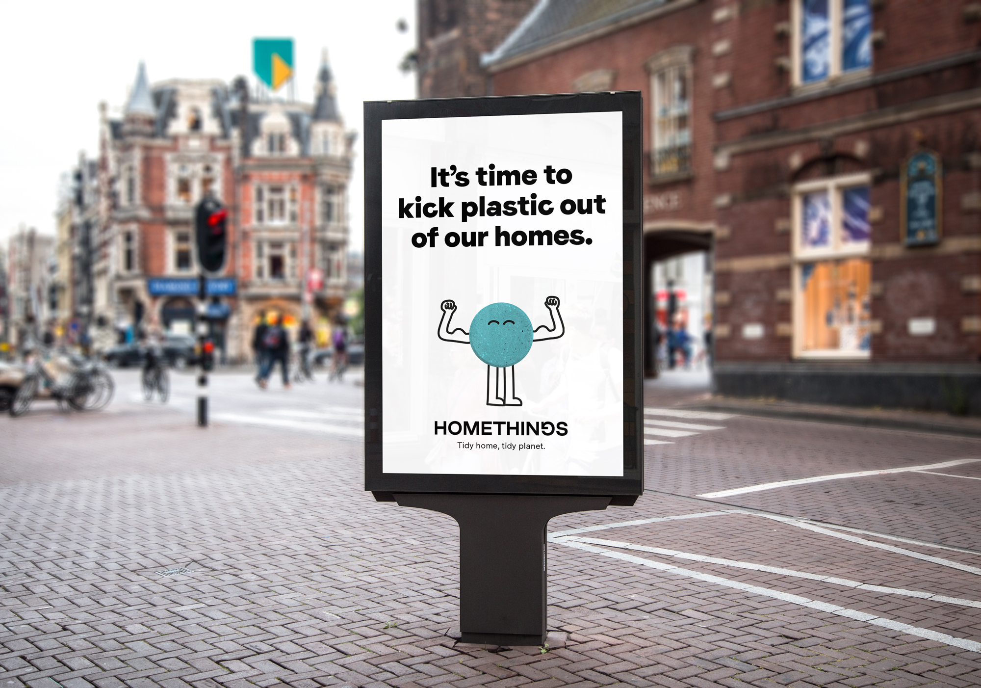
Homethings are reimagining household products in order to get rid of single use plastics once and for all. The visual identity communicates the maverick personality of the brand with bold typography, irreverant copywriting and a big attitude.
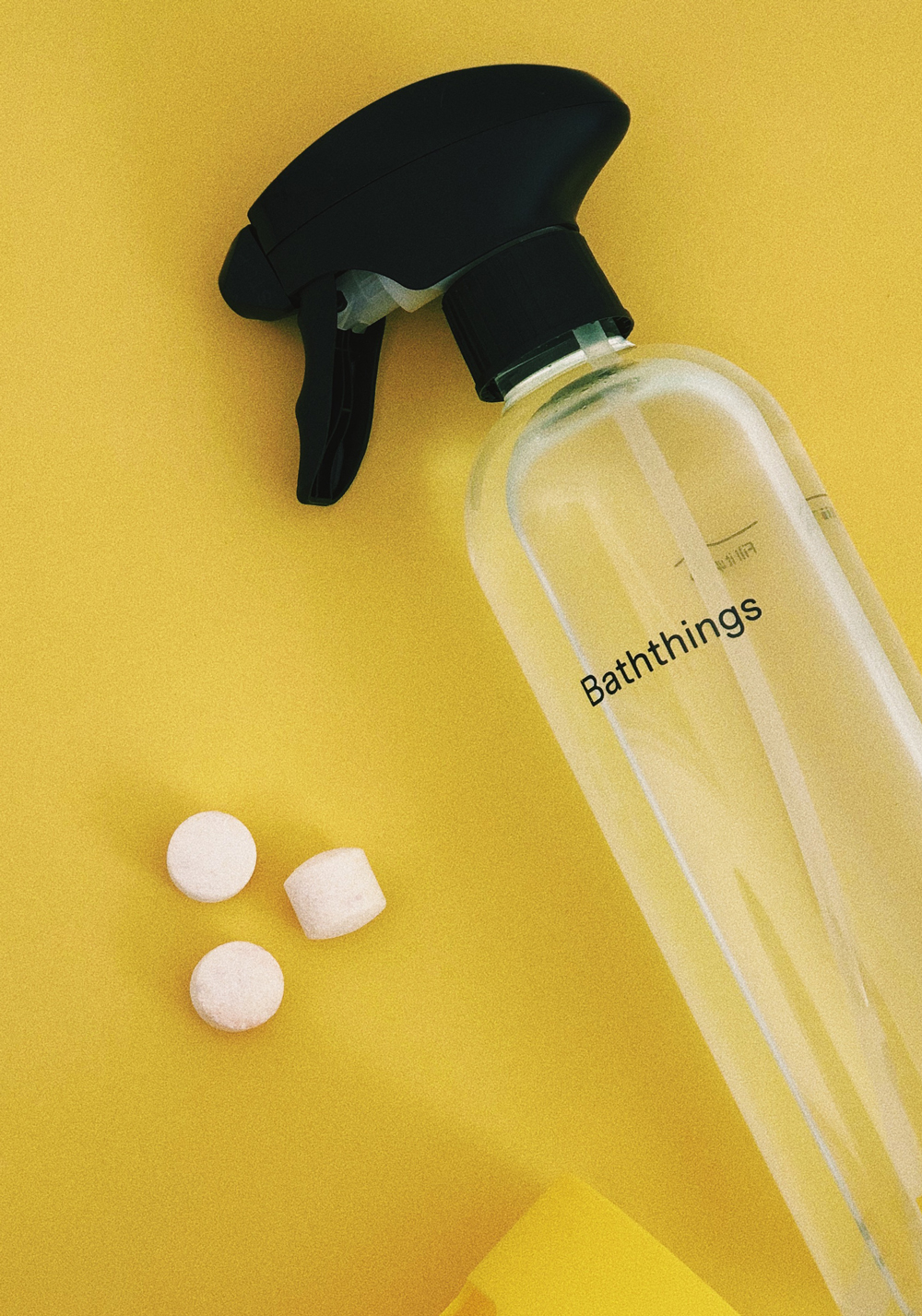
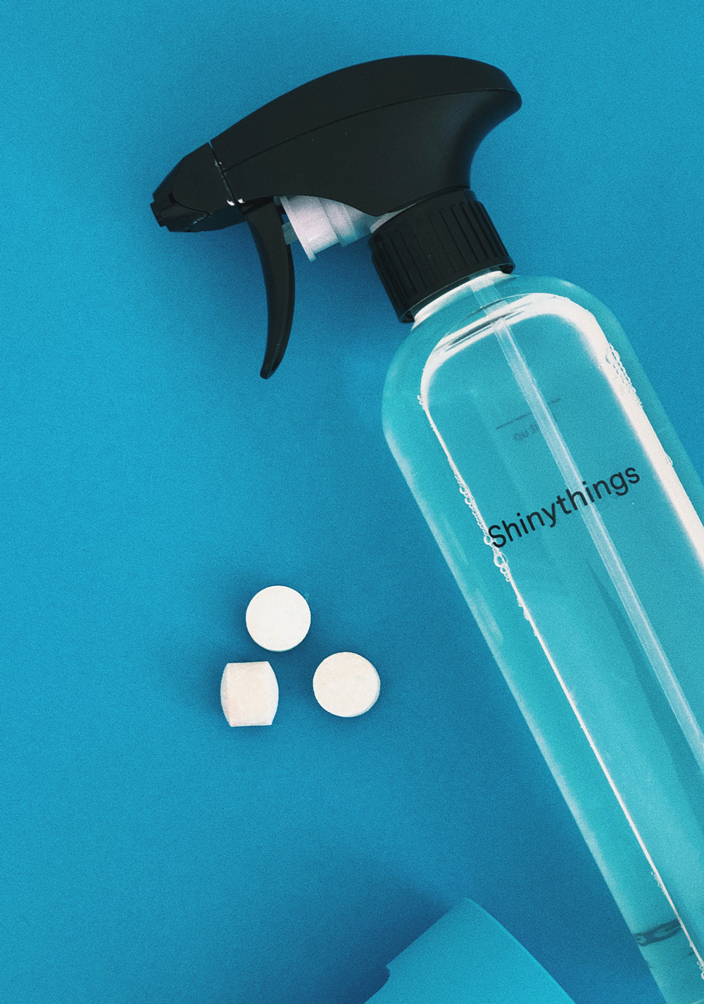
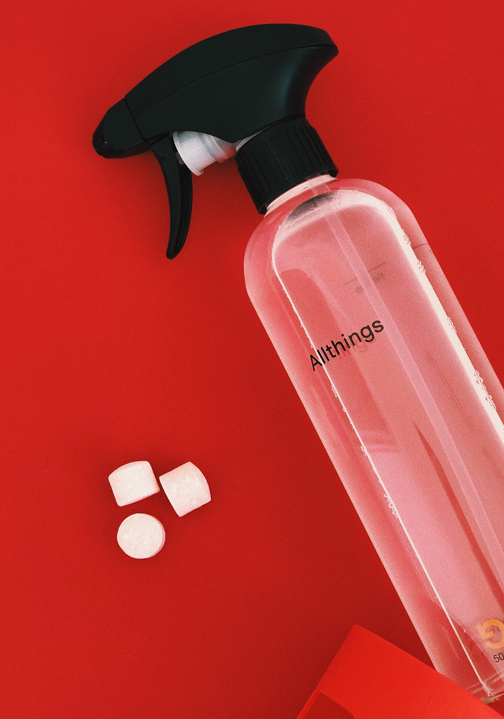
Images courtesy of Homethings
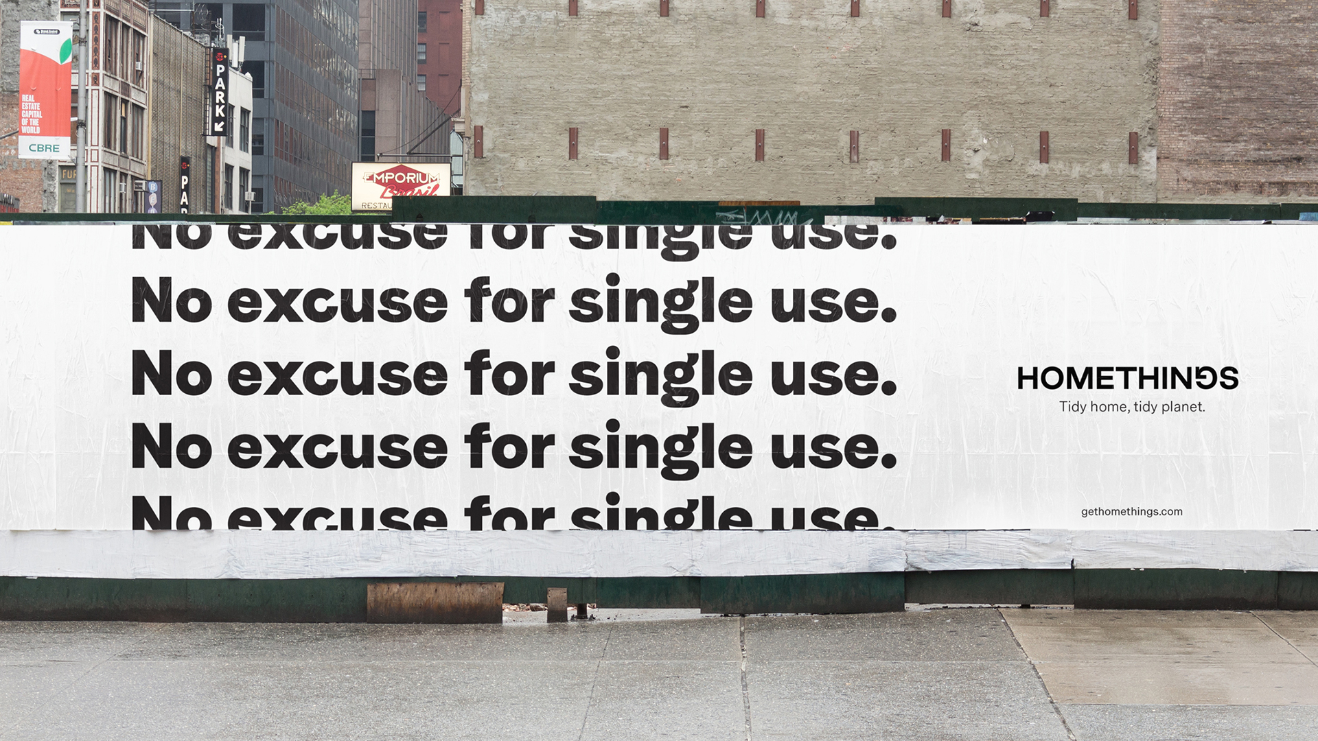


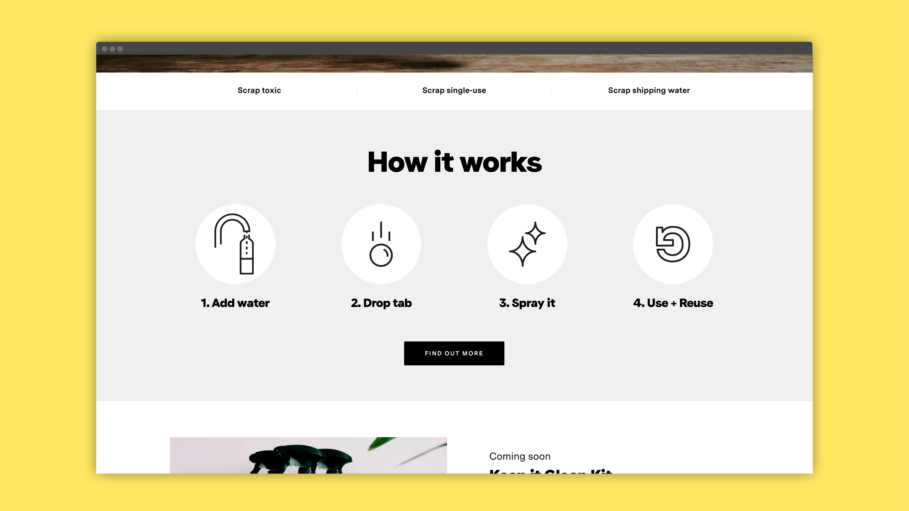

Website by Glass

What the client had to say
"Working with Josh was great. He really bought into our vision for the brand and the business and showed that through genuine enthusiasm and excitement to bring it to life through design. Josh quickly became part of our extended team helping us to conceptualise our vision and constructively challenging us when necessary. We were delighted with the outcome and would definitely recommend Josh to anyone in a similar position"
– Tim Keaveney, Co-Founder of Homethings
Tragaluz
Design ········· Josh Nathanson
Illustrations ·· Javier Mariscal
Client ········· Grupo Tragaluz
Location ······· Barcelona, ES
Website
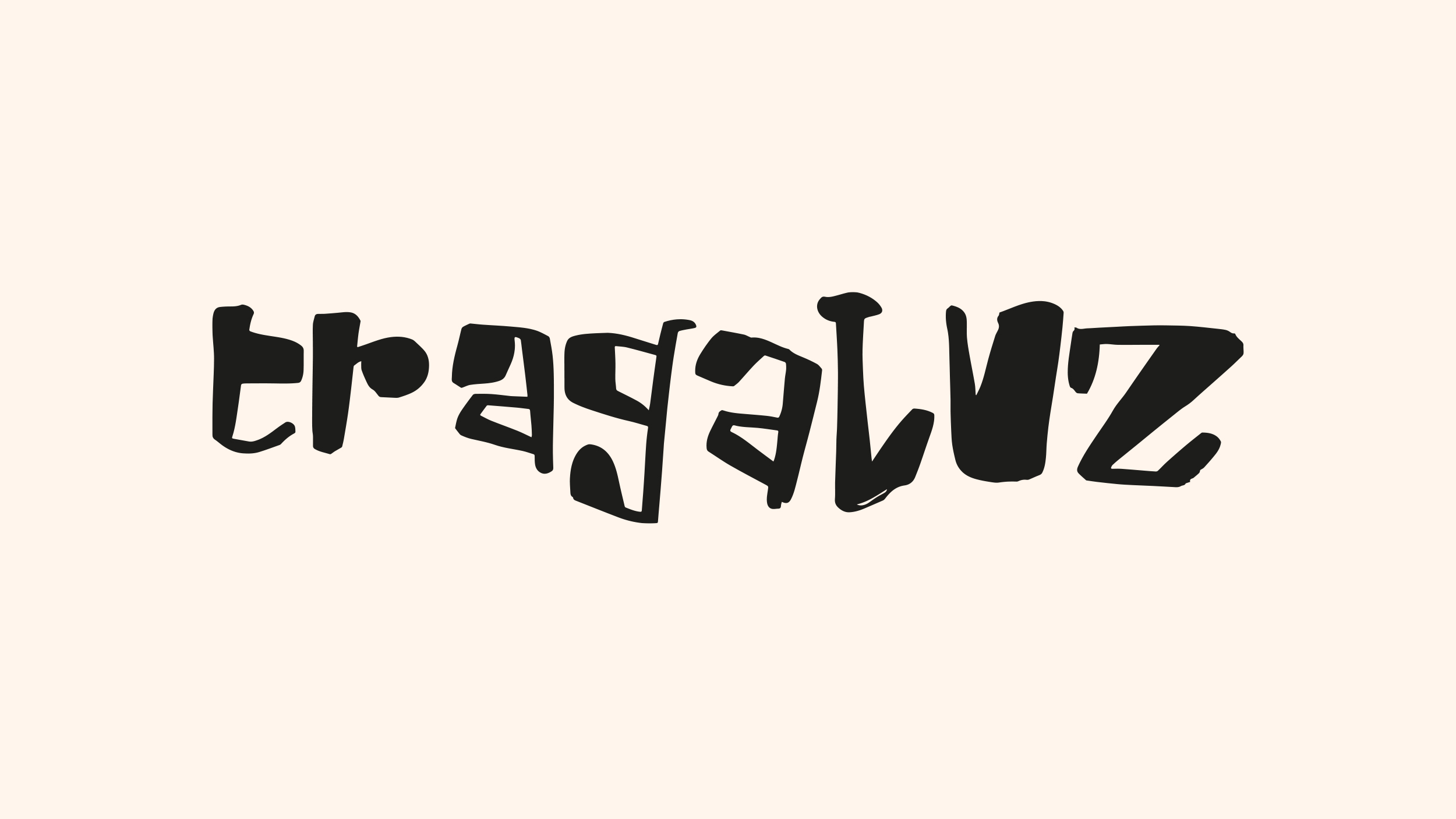
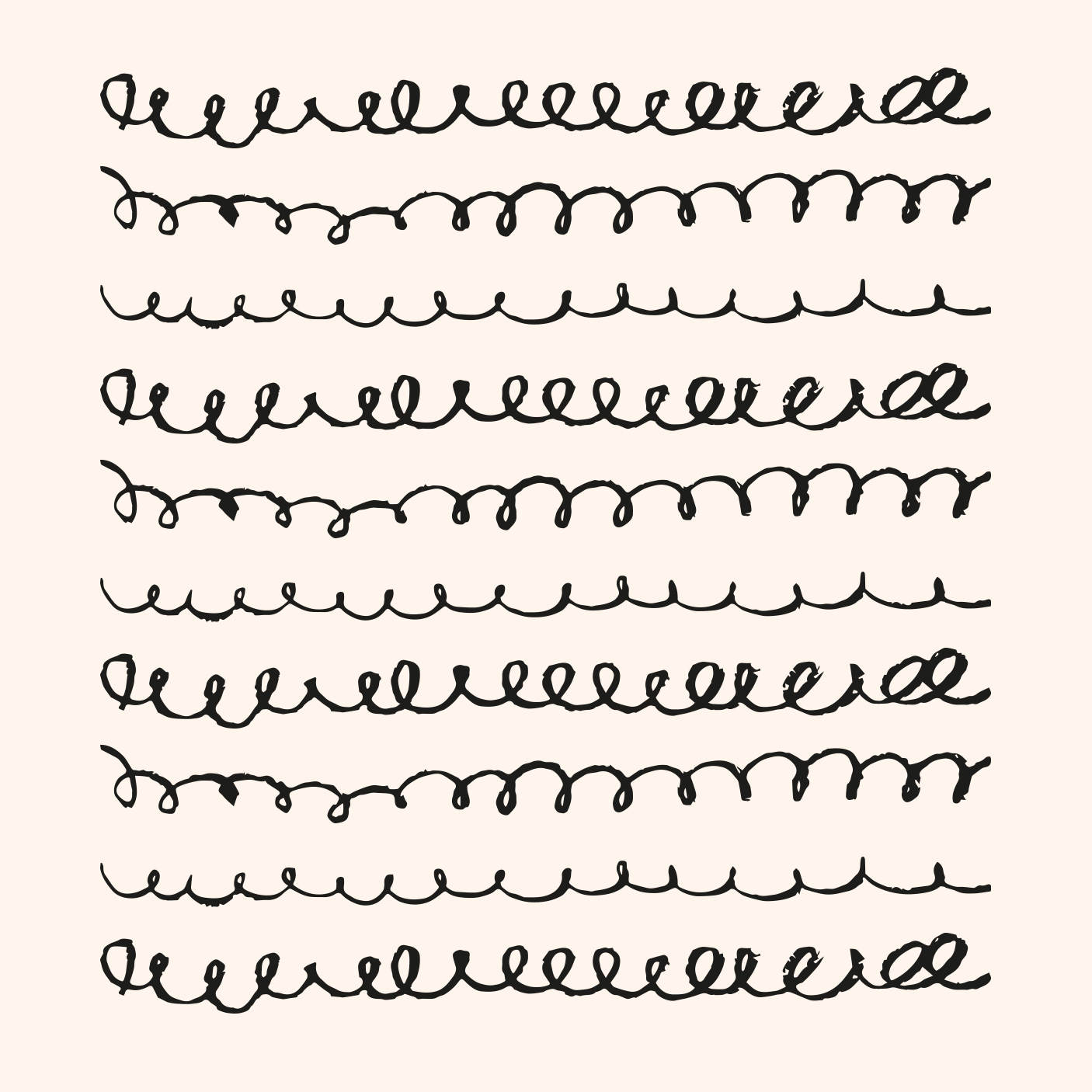
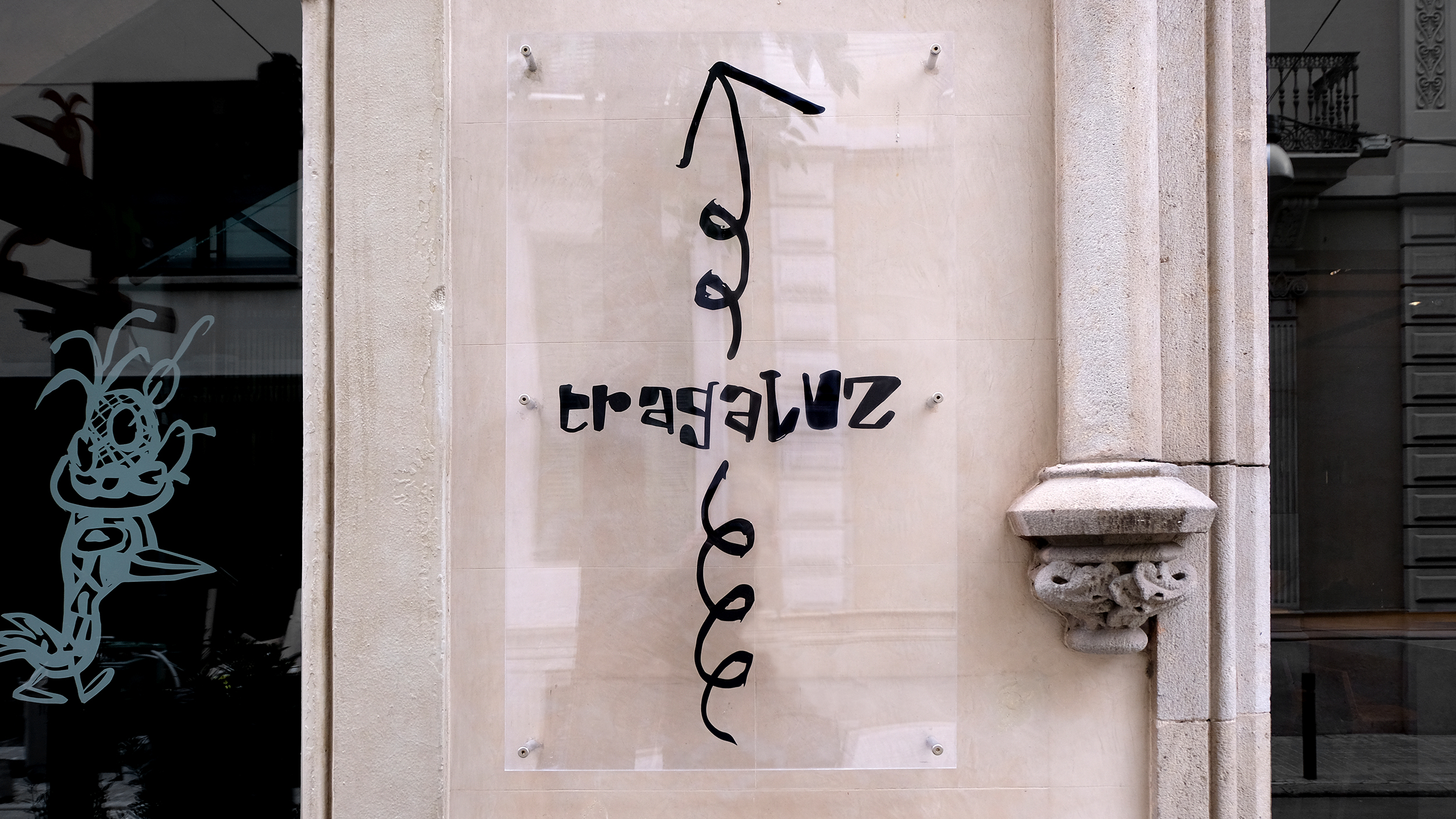
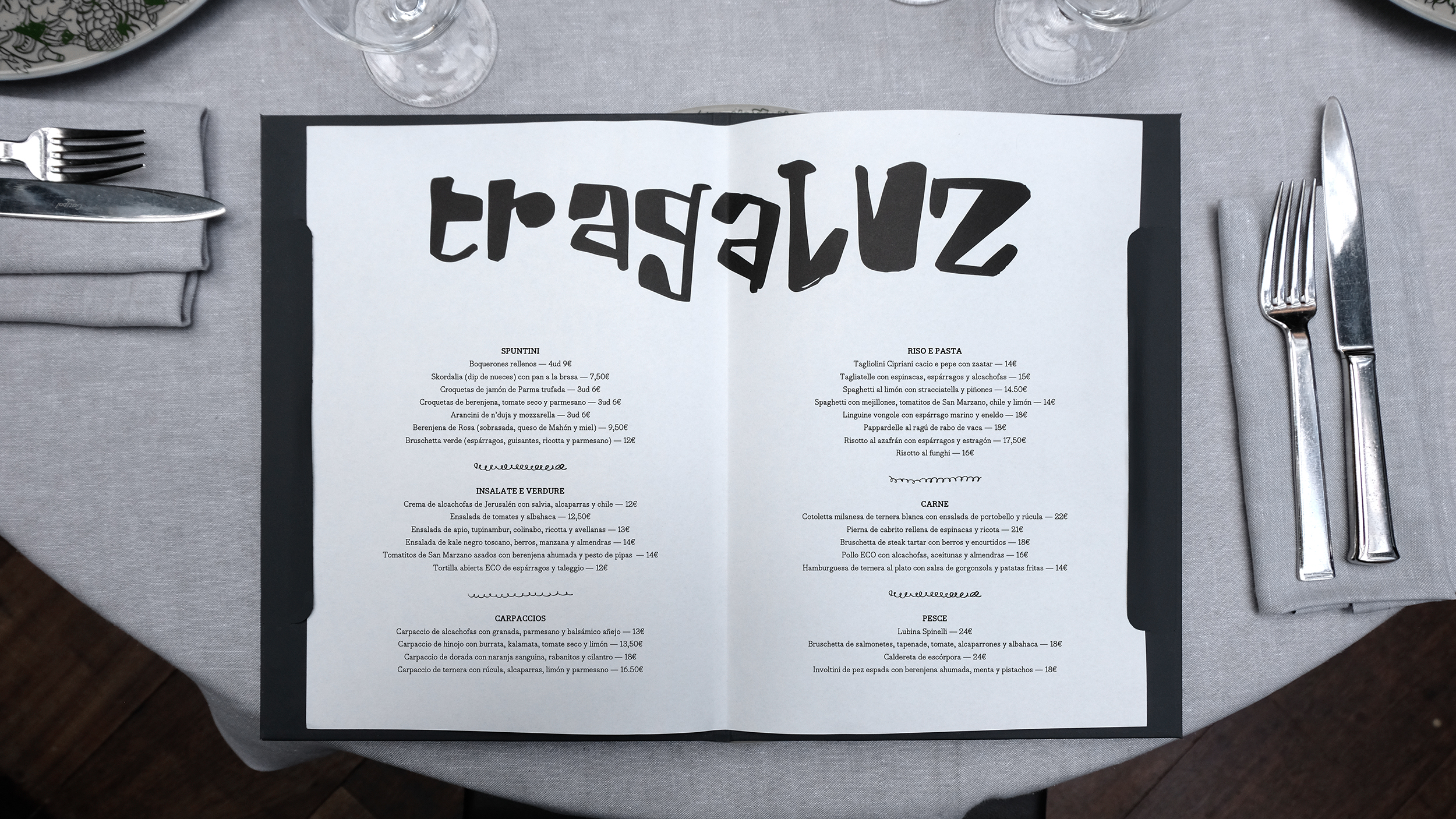
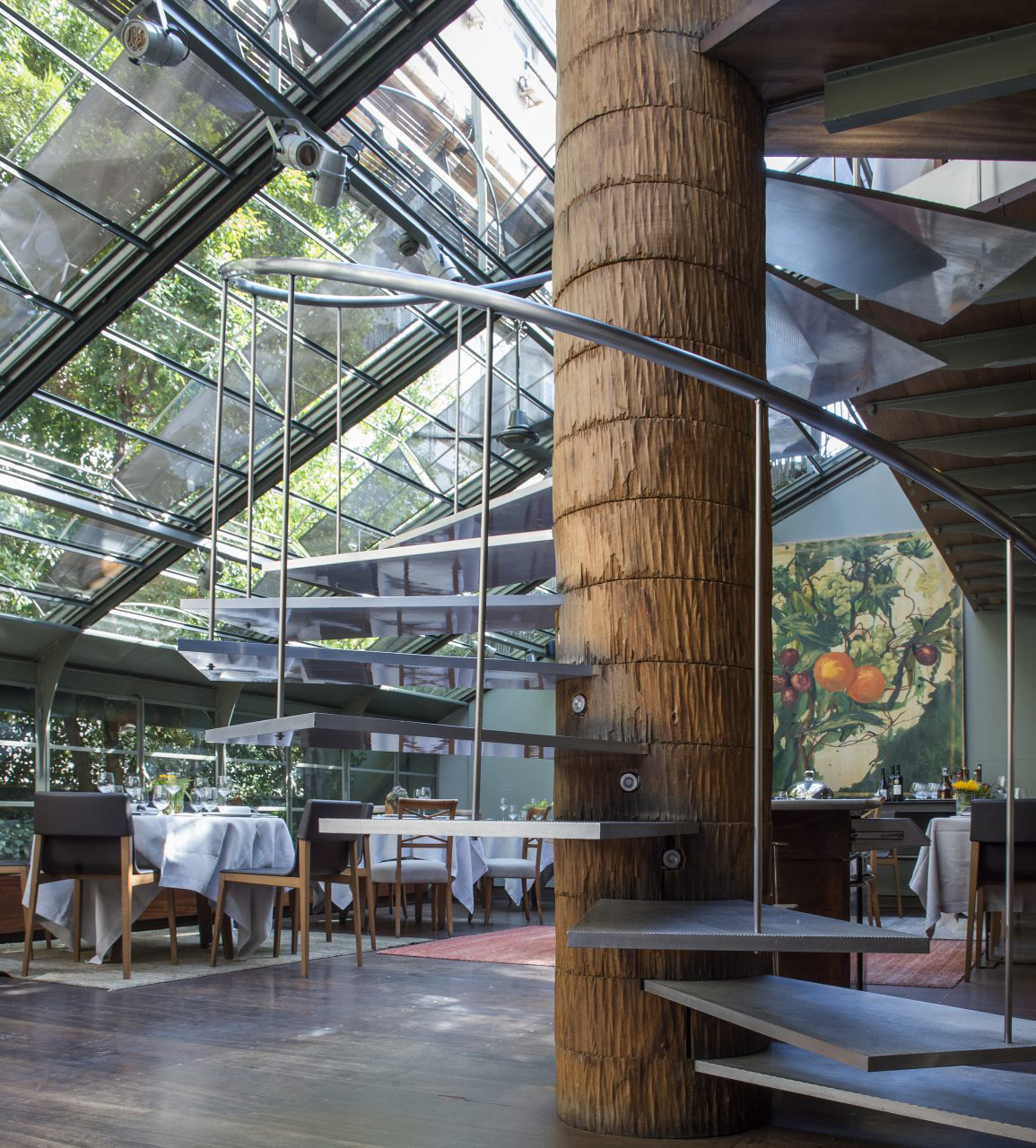
Tragaluz is the flagship restaurant of Grupo Tragaluz in Barcelona. As a nod to the rich design history of the restaurant we decided to dive into the archives of Javier Mariscal, the renowned illustrator, who created the original identity in 1990.
We bought back to life selected elements of his original drawings and put them at the heart of the look & feel that reflects a refreshed and more vibrant interior design & menu.
We bought back to life selected elements of his original drawings and put them at the heart of the look & feel that reflects a refreshed and more vibrant interior design & menu.




Les Filles Cafè
Design ········· Josh Nathanson
Client ········· Les Filles
Illustration ··· Kelly Knaga
Photography ···· Emma Donnelly
Location ······· Barcelona, ES
Website
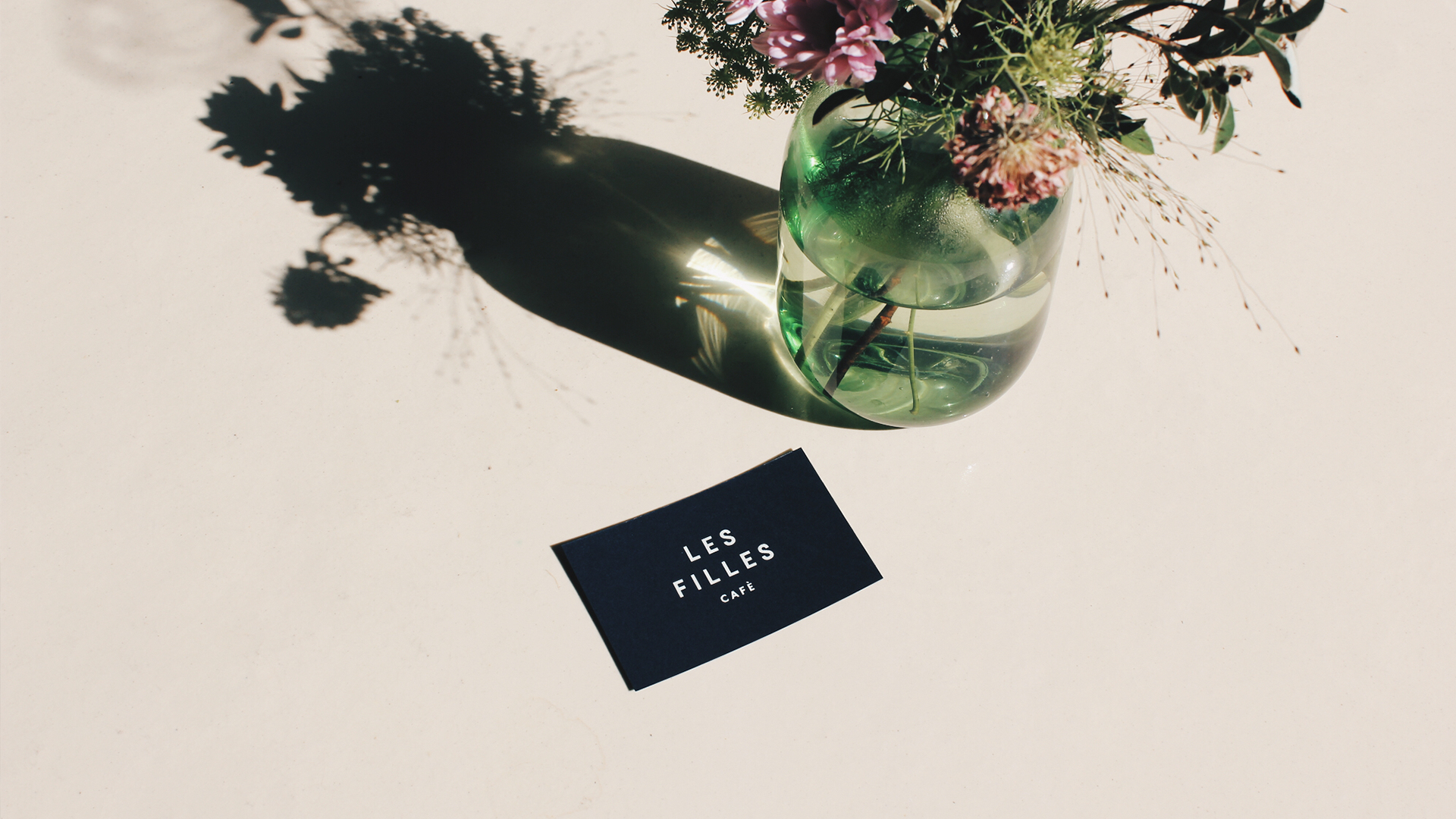
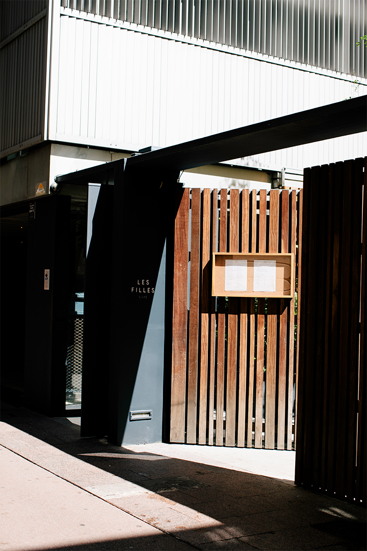
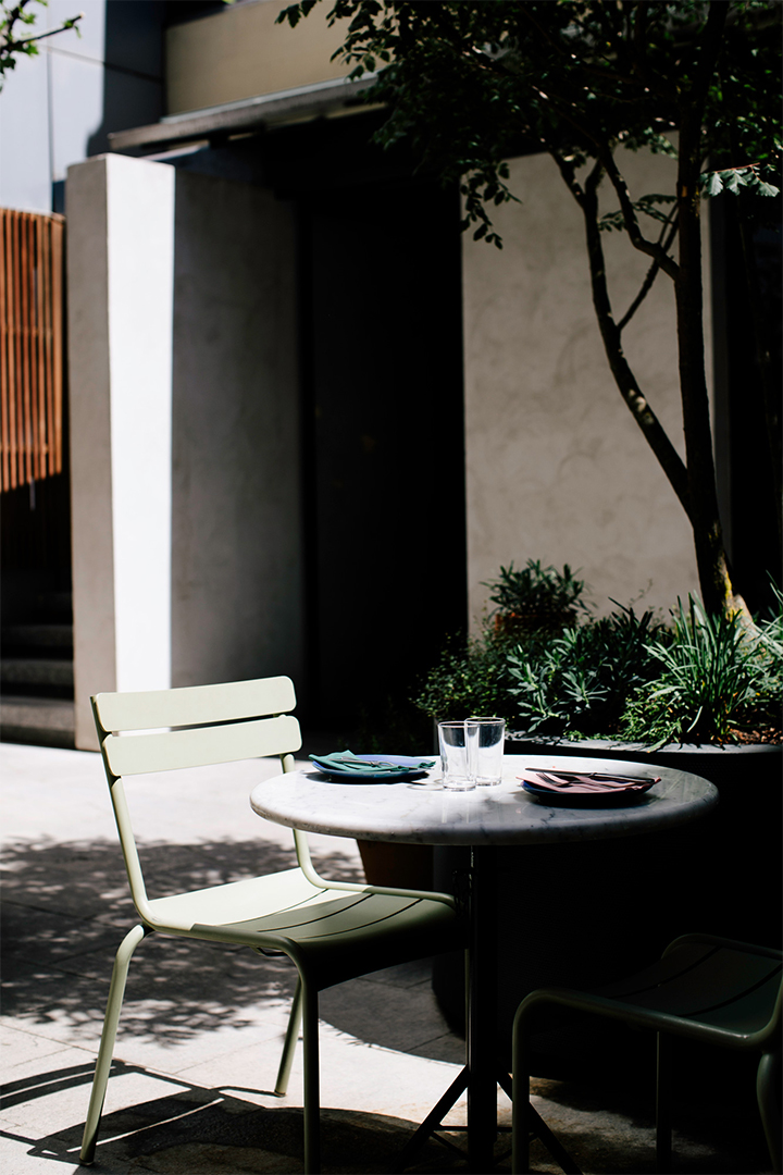
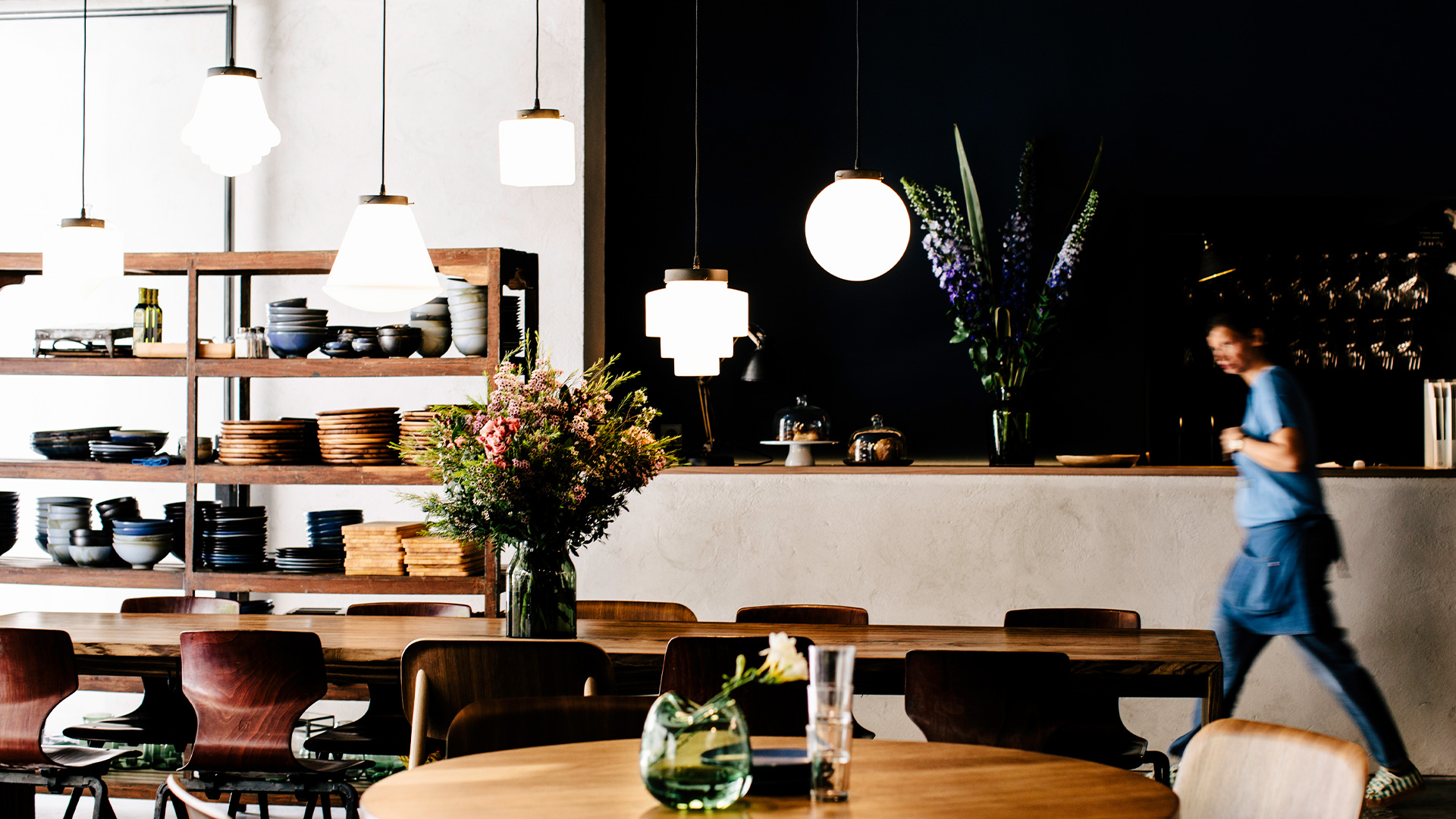
Les Filles is a café & restaurant offering a healthy menu made from locally sourced ingredients, served up in a beautiful oasis in the heart of Barcelona.
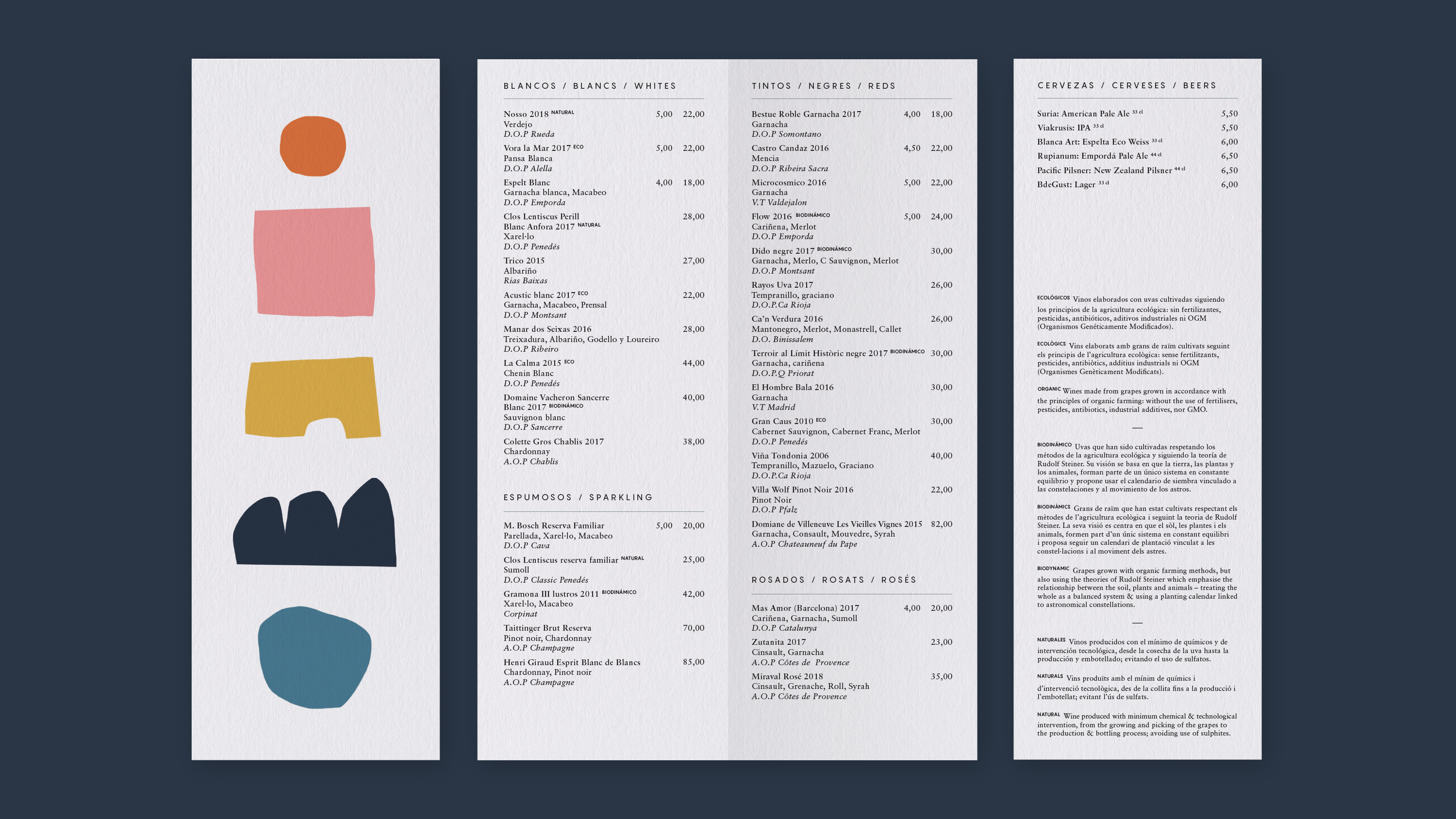
The identity is all about simplicity, restraint and setting a tone that embodies well-being and reflects the calmness of the space. Kelly Knaga was commissioned to illustrate the menus, conveying an abstract representation of nature.
The identity is all about simplicity, restraint and setting a tone that embodies well-being and reflects the calmness of the space. Kelly Knaga was commissioned to illustrate the menus, conveying an abstract representation of nature.
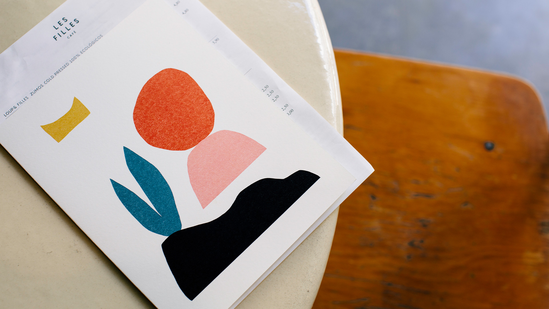
Menus illustrated by Kelly Knaga, who created abstract representations of nature & well-being.

Les Filles is located on Carrer de Minerva in Barcelona, so naturally it was oppropriate to place the owl of Minerva in the space to watch over and take care of the guests. (Photo by Marta Guillén, courtesy of Fantastic Mr Nilsson)
BdeGust
In collaboration with brandbuch
Design ········· Josh Nathanson
Photography ···· Joan Diví
Client ········· BdeGust
Location ······· Catalunya, ES
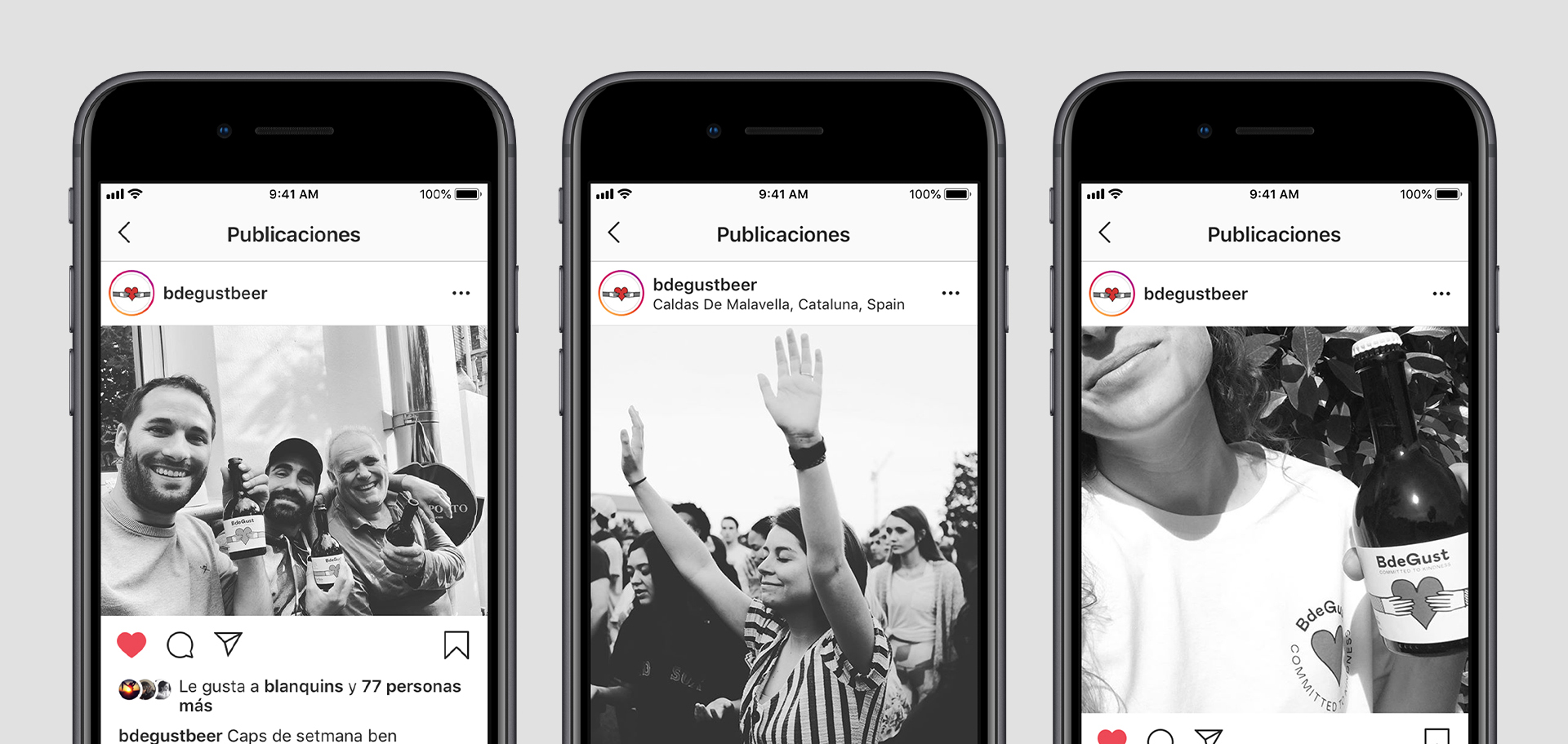
This project was born from a dream to create a business that not only makes delicious beers, but also helps make the world & the environment a better place.
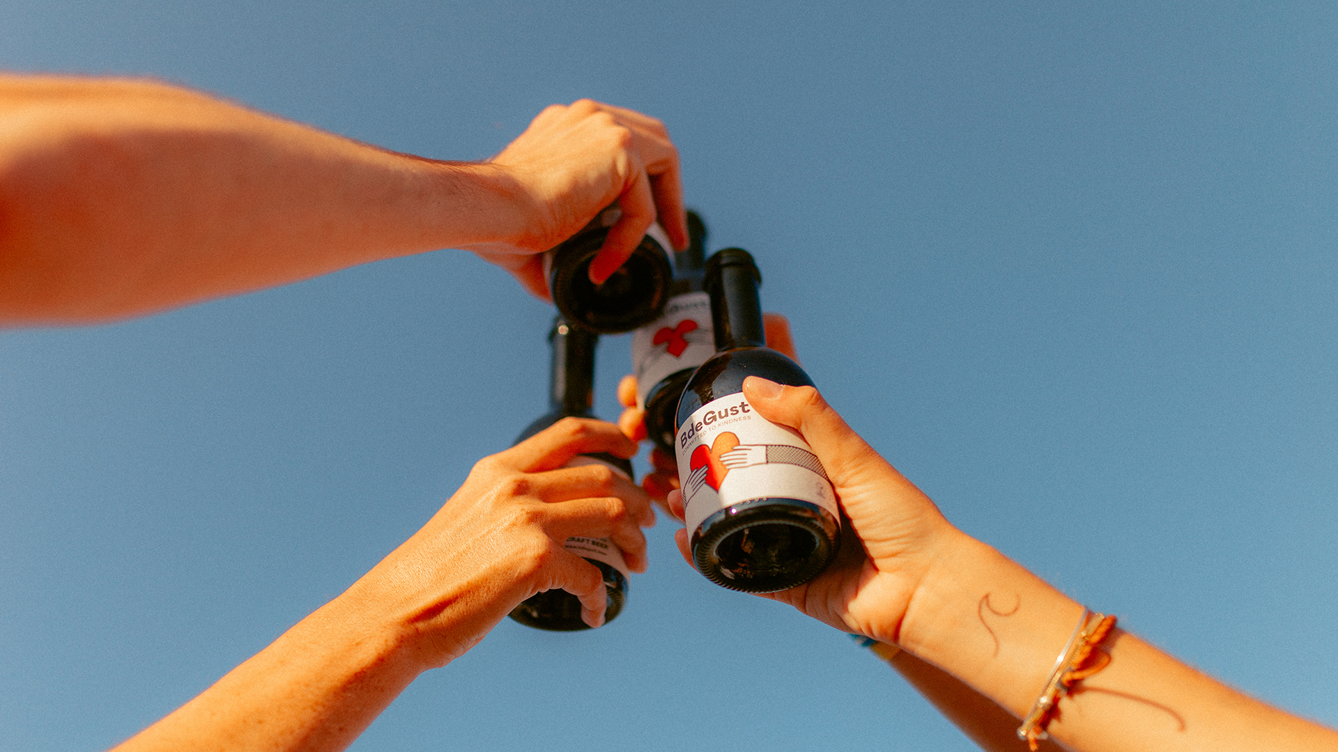
The result is BdeGust (deriving from ‘ve de gust’, which means “I feel like it” in Catalan), a socially responsible company. They are Committed to Kindness, a promise that is put front & center of everything. They grow their own hops locally, hire people who are at risk of social exclusion & a percentage of their profits go to charity. So this required an equally caring design to match...
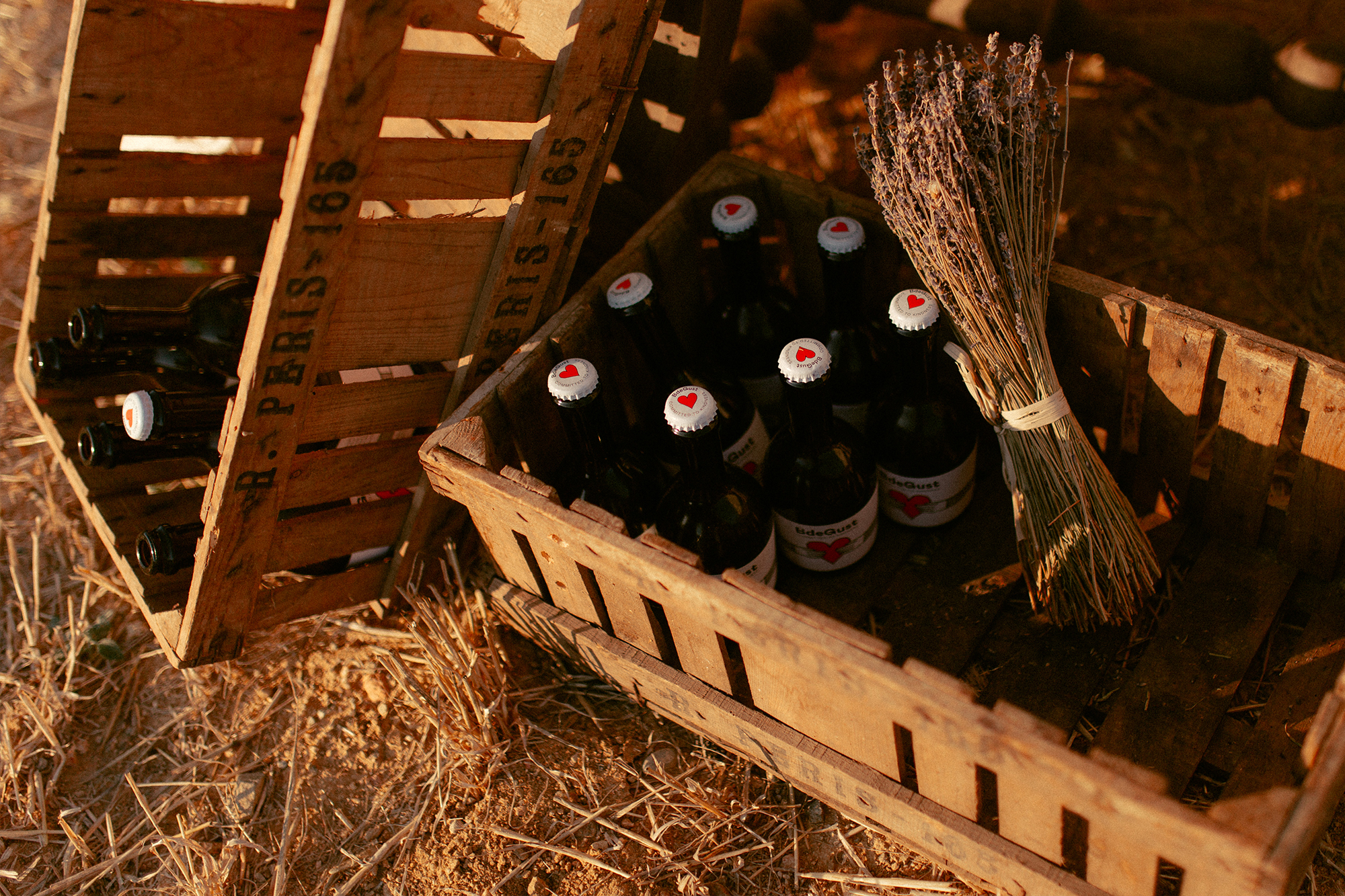
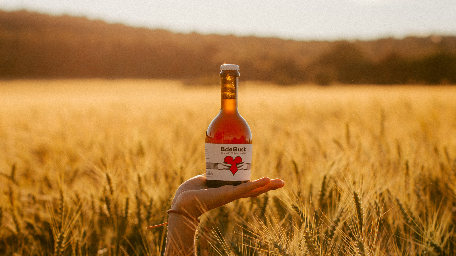
Each bottle is illustrated with a hug, to represent the kindness that this brand expresses. The hands come together to hold a heart, the purest symbol of love & joy that BdeGust wants to give back to the world.
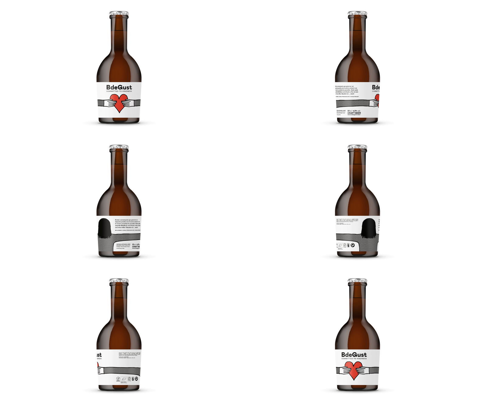
The packaging is designed to give a 360° hug.
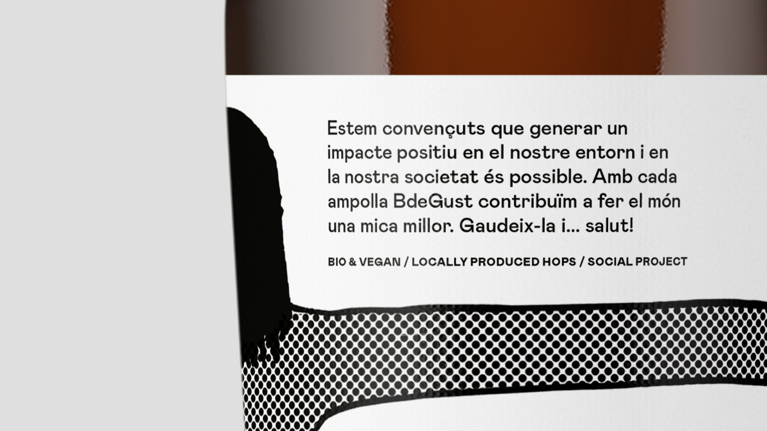
This roughly translates as: “We are convinced that generating a positive impact on our environment and in our society is possible. With each bottle of BdeGust we help make the world a little bit better. Enjoy it and... cheers!”
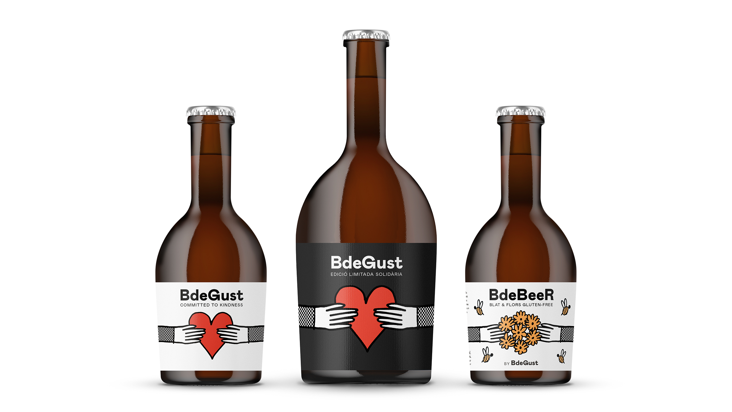
BdeGust was the first in the family. It was followed up with a wheat beer called BdeBeeR. For this they collaborated with Asociación de Abejas Silvestres (Wild Bee Association) to create a habitat for wild bees right next to their own field of hops.
For Christmas 2020 they created an XL version of BdeGust. For each bottle sold they gave 1kg of rice to a local foundation that feeds people in need.
For Christmas 2020 they created an XL version of BdeGust. For each bottle sold they gave 1kg of rice to a local foundation that feeds people in need.
